

As students of interaction design in Politecnico Milano, this project allows us to redesign and develop the mobile app of Politecnico di Milano for students from students' perspective and through the user research methods. The process of acquiring insights is completed with two main parts: the redesign of the app by redicovering the user needs, and the creative idea to enrich the experiences. The redesign process is conducted through the real user testing and analysis to get the points in need for improvement.
In the value adding stage, we focus on the international students overseas, to see the real needs and investigate more about the studying and life aborad to help the 6728 international students at POLIMI.
We were also excited to find out that our interest fit in perfectly with the two value areas of the design brief presented that students seek the most: Meaningful Relations and Culture in Proximity. Combining the two explorary directions, we reframed the question as our starting point and the guide of value proposition throughout the redesign process.
Round 1 : Redesign the exsisting functions

Round 2 : Enhance the user experience by creating new features

The first objective of the redesign is to optimize user experience as a mobile native app, in order to make the app a tool for daily usage with appropriate functionalities for mobile. Then we aim to minimize user input to improve efficiency, by optimizing the steps users take to achieve their objectives and make all the services in a proper hierarchy. Also to improve UI elements intuitiveness, to improve overall aesthetic and give timely feedback with the interactions.
Optimize user experience as a mobile native app &
Minimize user input to improve efficiency &
Improve UI elements intuitiveness
The new POLIMI app is a campus application that offers costomizable and convenient access to needed information. The new app provides an optimal user experience for students through simplifying user workflows and improving the UI's intuitiveness.
In order to get users’ personal interpretation through their grouping logic, we conducted a card sorting with the online card sorting tool by asking the respondents to complete the online testing session.

After the card sorting we have got the groups of functions of users' metal mode, to get users’ personal interpretation and evlaute the hierarchy of the information architecture, we conducted tree testing. Respondents were asked to complete 4 designated tasks. We provide the users pictures of labels according to their choices.

The card sorting and tree testing has conveyed the users' mental mode of the app. The information architecture has been generated by combining the result of card sorting and tree testing.


The final visual style is glassmorphism, which has transparency (frosted-glass effect using a Background Blur), multi-layered approach with objects floating in space and vivid colors to highlight the blurred transparency.
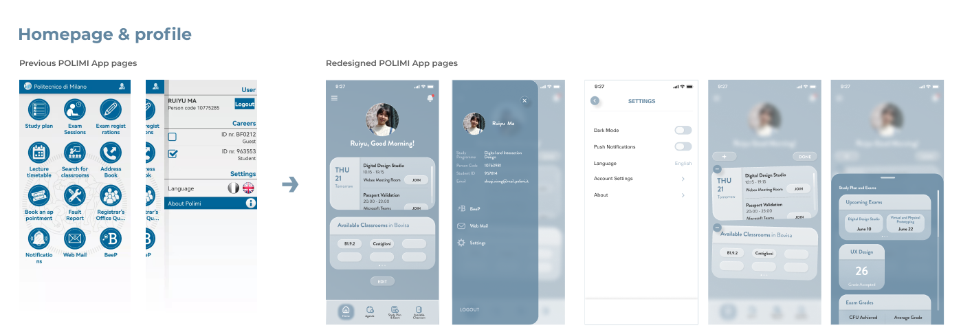
On homepage, users could manage their homepage functions by editing the widges in order to get a quick access to the functions which they use more frequently.

The class timetable displays as a canlendar, and through clicking the class in the timetable, user can view the classrrom details and can have a direct access to the online classroom if the class is held online.

The classroom searching function is designed as a map to view the location directly and is connected to the external application like the google maps to get a quick navigation for the students who come firstly to the classroom. In addition, it displays the available time of a classroom for students who want to use it as a study room.
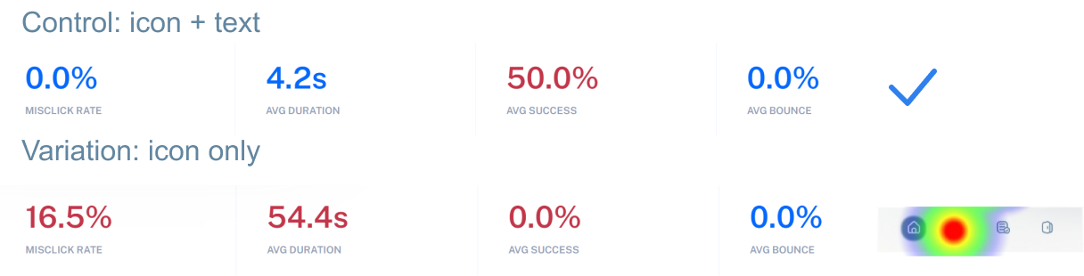
To validate design hypothesis and find out the layout with the best performance


Through the desktop research, we found that, like many other topics in this digital world, the information international students are looking for can be found in multiple locations. As a generation of digital natives, students nowadays also adapt to the norm of overloaded information.
However, during our research, we also realized there is a strong demand for a one-stop location to access all necessary information easily without jumping back and forth between multiple platforms.
How Might We?
“How might we create a tool that helps international students discover opportunities and grow their knowledge and passions in an easy and personalized way that also empower them to create a sense of belonging.”
Our concept was a combination of a resource collection and an online community because we believe that it can solve the problem international students are facing nowadays such as finding reliable information quickly and developing a sense of belonging through making meaningful relationships with classmates and peers.
We want to add a function for comprehensive collection of resources to POLIMI application, to help international students get quick accesses to the solutions of the problems they are facing at each stage of the study abroad experience.
The online survey through WhatsApp and Facebook groups enable us to reach out to a wider population of international students from various backgrounds. We designed the survey based on the knowledge we gained from the previous focus group to validate the pain points we identified from the journey and to collect feedback for our concept. We have received a total of 14 responses.
The result showed that 7 respondents say they have found it difficult to find an accommodation, while 6 respondents say they don’t know how to apply for a resident permit in a foreign country. And 7 out of 13 respondents agree that having a detailed guidebook and have it embedded into the mobile app is helpful make the process of finding information more efficient and support them to complete tasks.
Also thanks to the survey, we have got some features to be emphasized in our guidebook:

We kicked off the concept proofing activities with a focus group discussion with 4 international students. In order to collect feedback and expectations from them for our concept formulated.

Based on the user research, a digital experience map was made. The map tries to capture all the important touchpoints along the user journey such as the exposure of the service through social media. The map aims to offer users a more immersive feeling of the concept proposed by involving a sample international student image.


For testing the lo-fi prototype, we created three scenarios where our guidebook can come in handy for the international students during their trip abroad, which are to find out my journey page, uploading the visa and contact students office.

In order to introduce the functions of Guide-Mi to international students who open it for the first time, and combined with the results of the low fidelity prototype test, we added an instructional animation here, which will also be helpful to take the peer review.


To avoid misunderstanding and show the status clearly, we change the square icon which seems like clickable to the circle icon. And we redesigned the progress icons. Also, we added a latest notification on the applying page to remind users of some important notifictions.

After the iteration, we have created our final prototype. The final project is the combination of the design round 1 and round 2. Improvements to existing features and the addition of a new Guidebook make the Polimi Application more tailored to provide a convenient experience for students.


